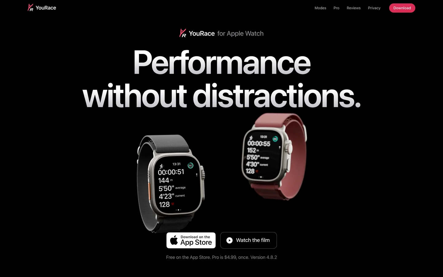
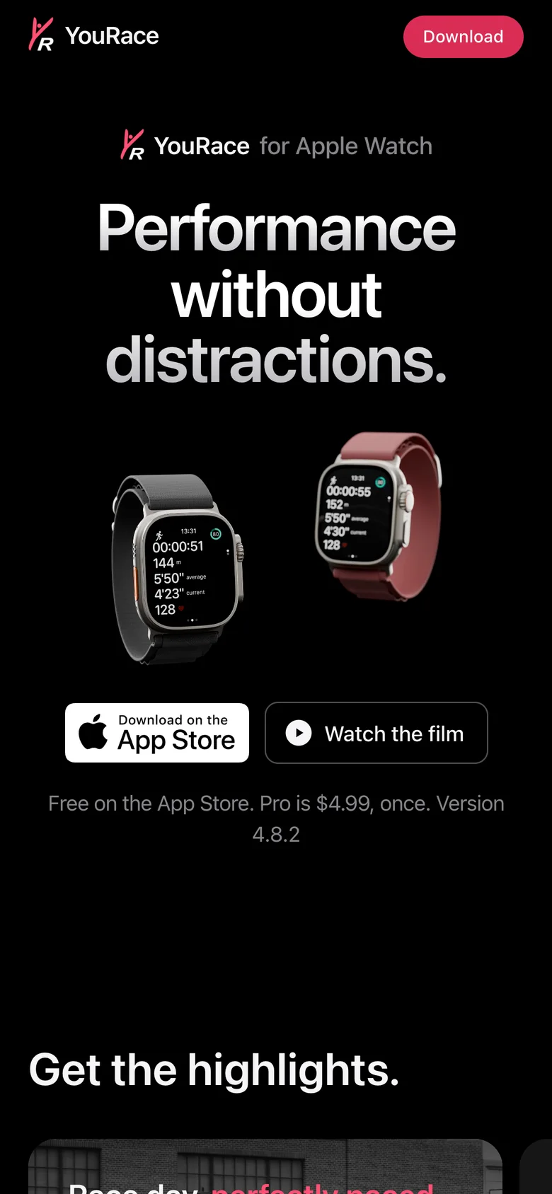
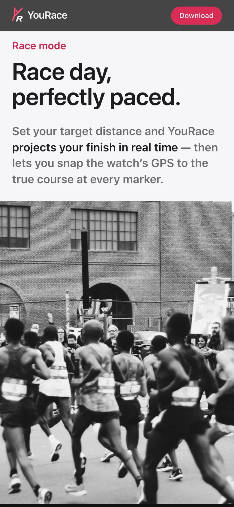
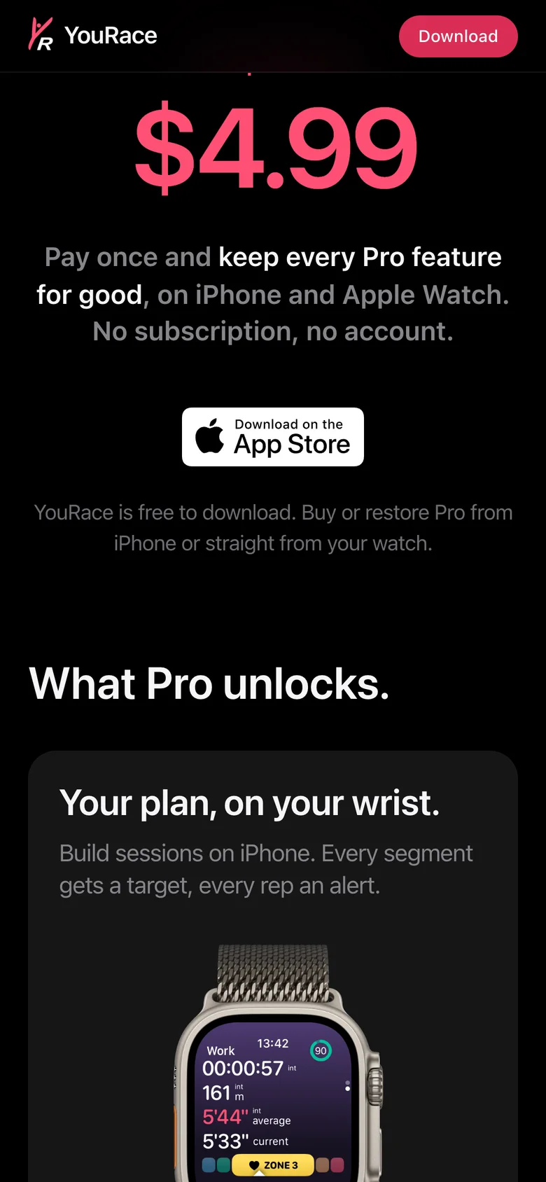
I redesigned the website of an Apple Watch running app, from its structure to its opening film.
Role
Web design, art direction and front-end development
Status
Live website
Platform
Web
Year
2021 / 2026
Tools
Next.js / TypeScript / Blender / Firebase Hosting
YouRaceWeb design, art direction and front-end development
Overview
YouRace is an independent running app for Apple Watch. I have designed its website since 2021, not the app itself.
Solodesign, code and film
5 yearson the same site
2languages, English and French
Inside the project
How I approached it
Start from what a runner wants to know
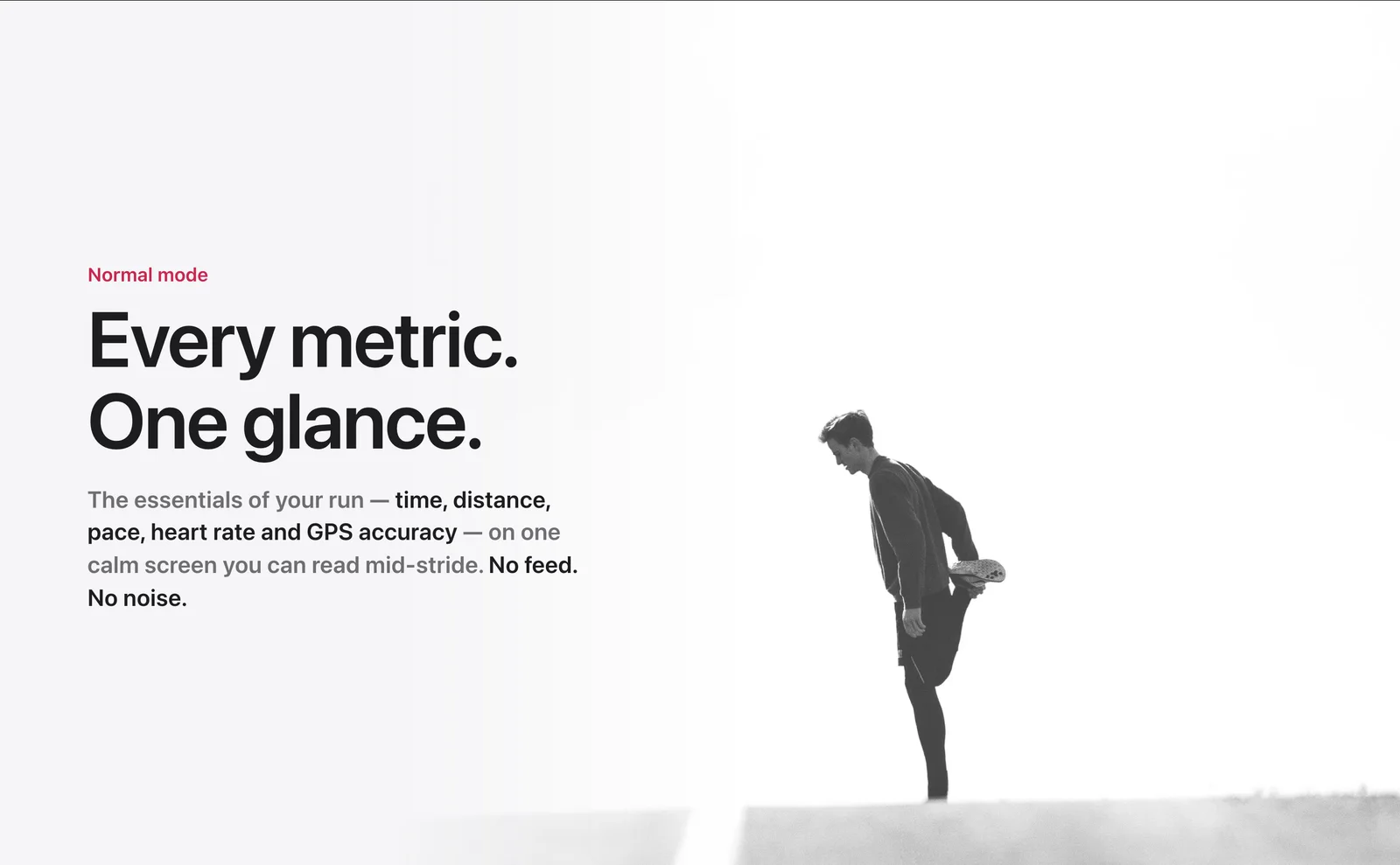
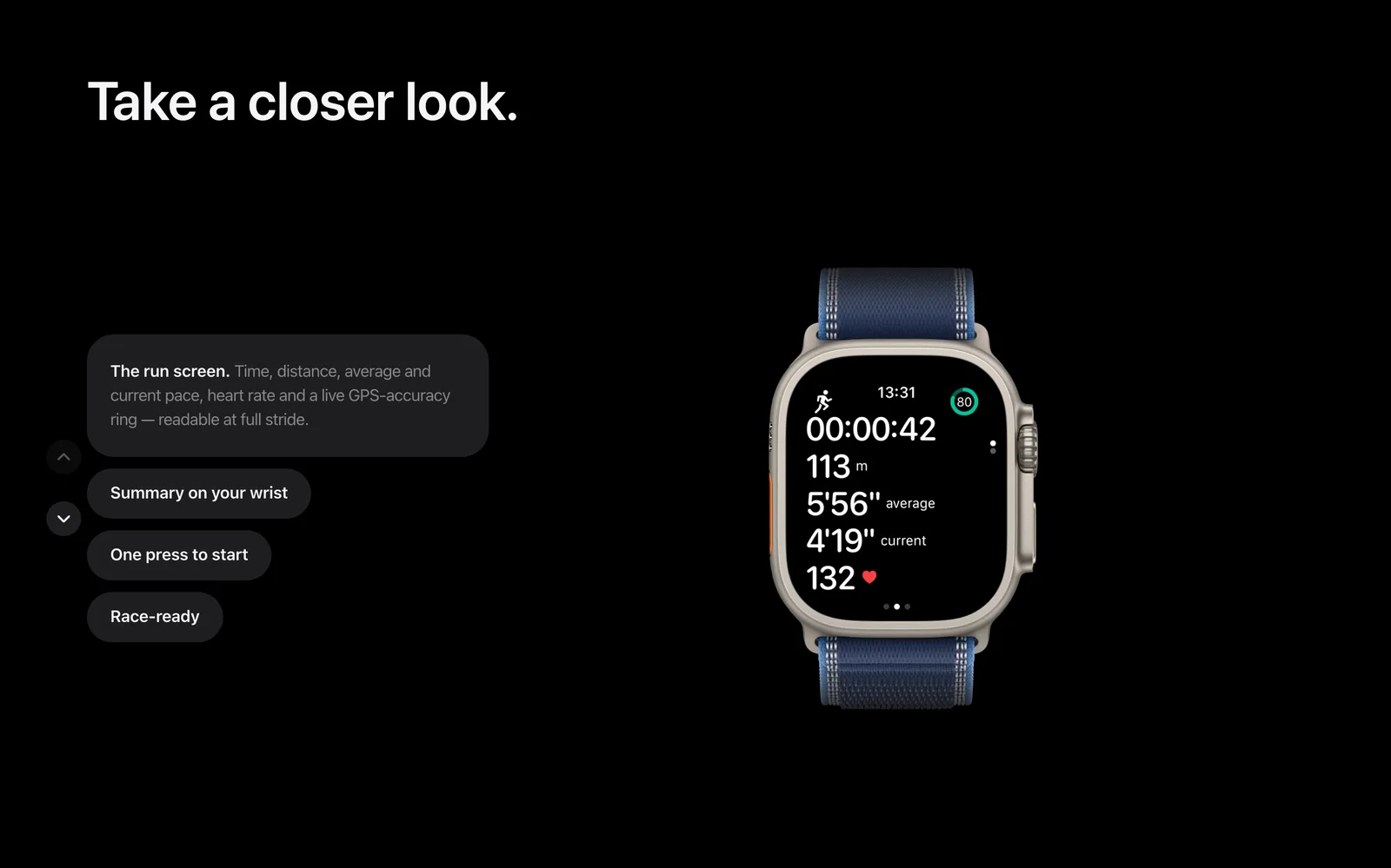
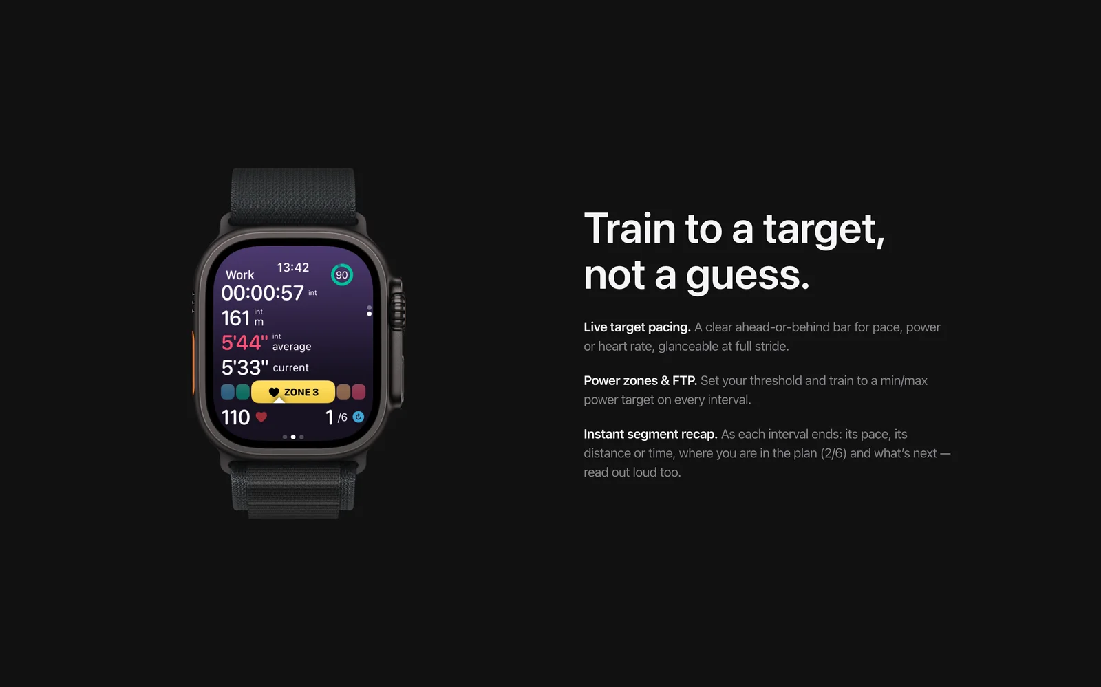
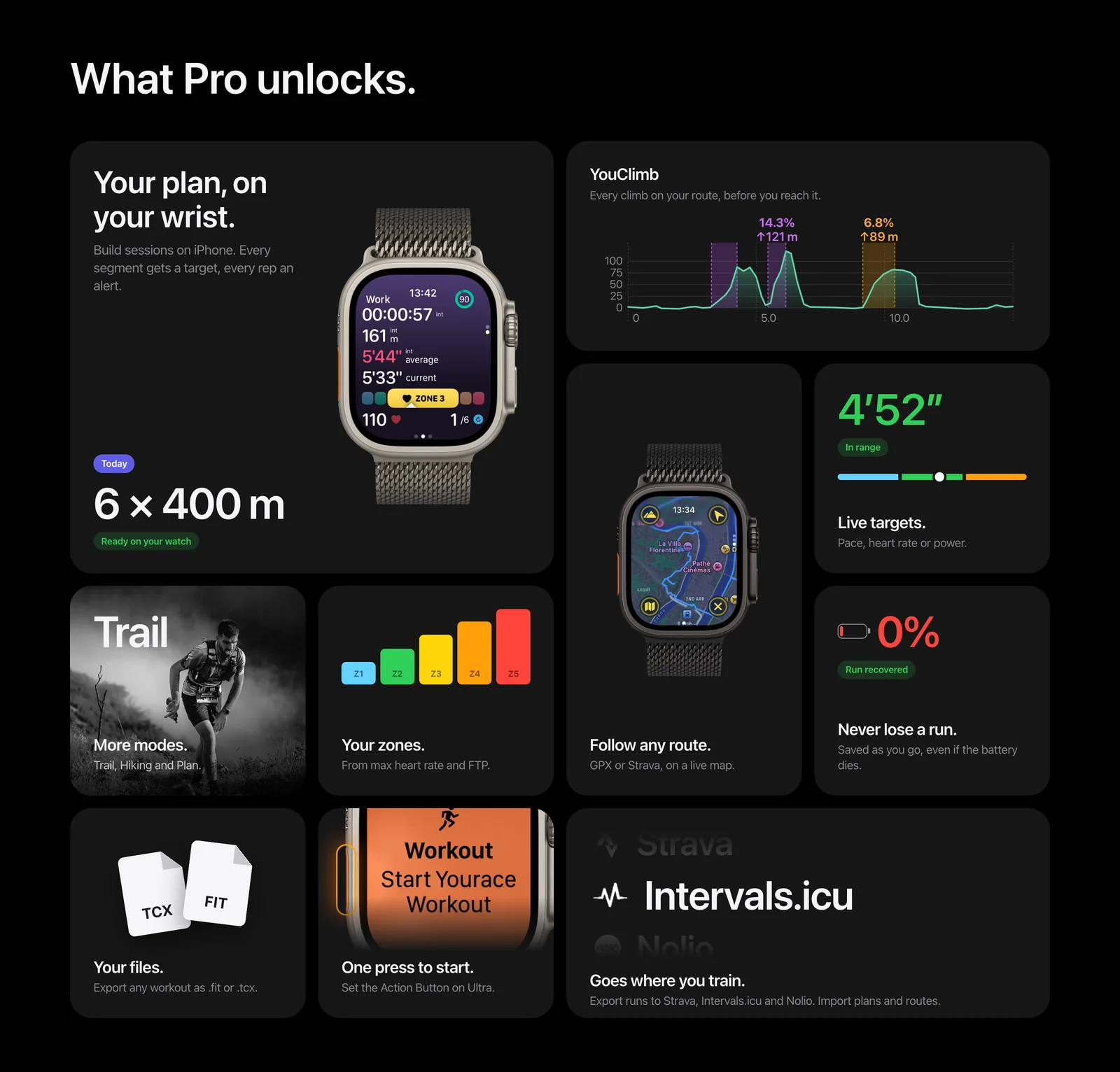
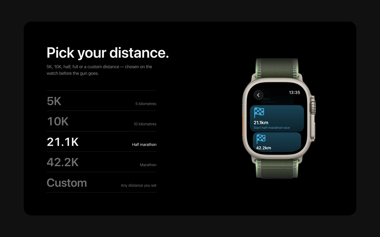
The old page listed features one after another. Before designing anything, I sorted them by the questions a runner actually asks: what will I see during a run, can it handle my intervals, will it pace my race. Those three answers became the three chapters of the page. Everything else went into a single grid.
Aim for the level of the big brands
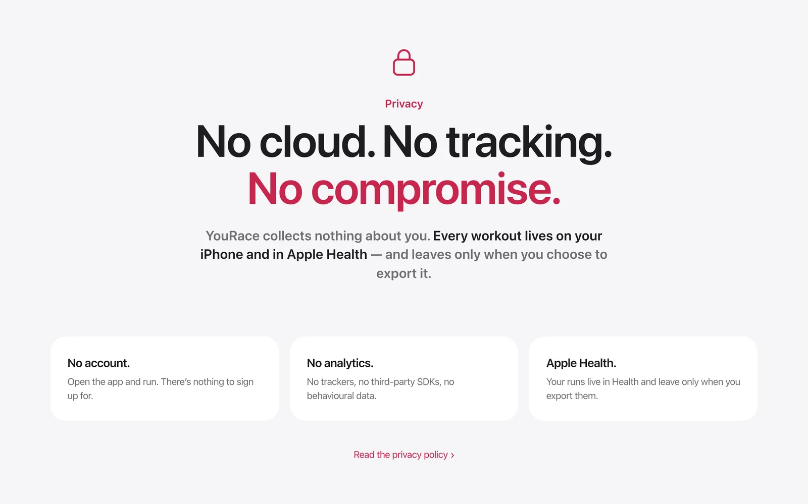
Runners compare YouRace with apps from much larger companies. An independent app has to look at least as trustworthy. I took Apple’s product pages as the reference: large type, black and white photography, the product shown large, and a four second opening film I made in Blender.
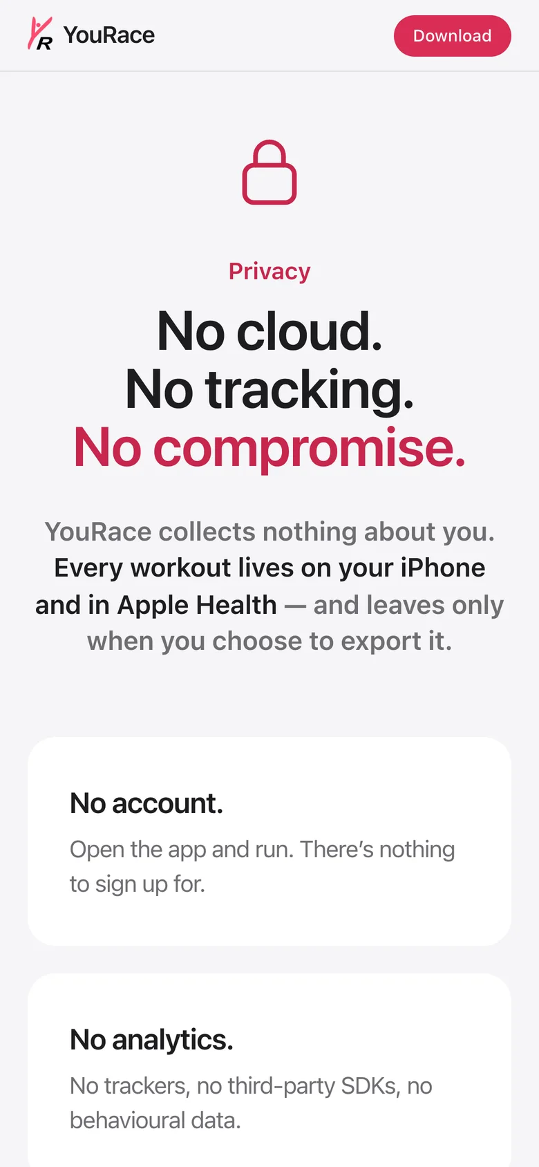
Just as careful on a phone
A runner is as likely to discover the app on a phone as on a computer. Every section was reworked and checked at phone width, down to how animations behave when someone scrolls quickly, so nothing stays hidden or appears late.
The same chapters at phone width
Easy to keep alive
A product site is only useful if it stays accurate. Replacing a product image means swapping one file, the version number and reviews update on their own, and both languages are set up to be found in search.